Luke Robertson Studio for By No Means




- Scope
- Brand identity
- Brand guidelines
- Packaging design
- Art direction
- Social media
- Photography
- Annika Kafcaloudis
- Food styling
- Stephanie Stamatis
- Post production
- Ring Studio
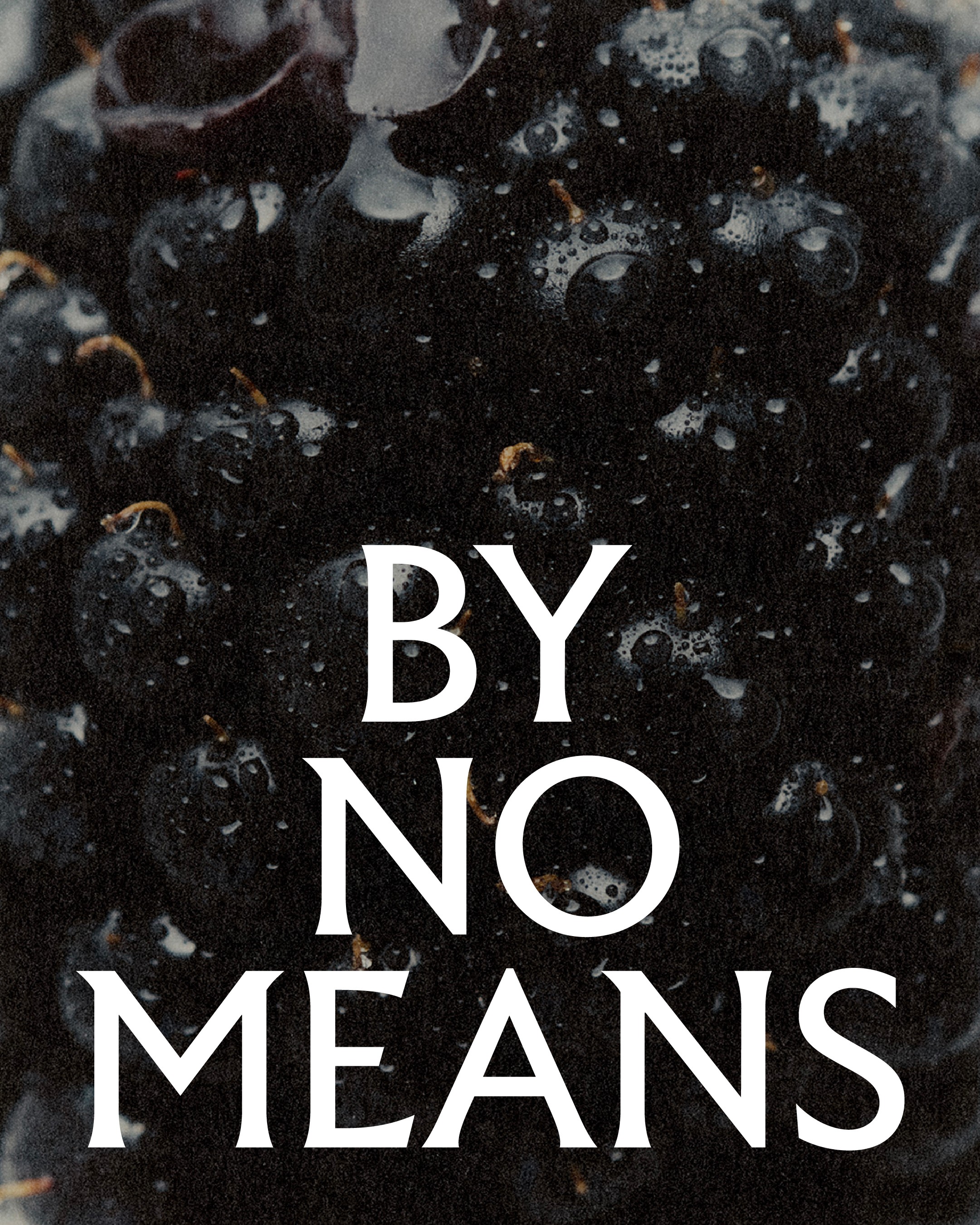
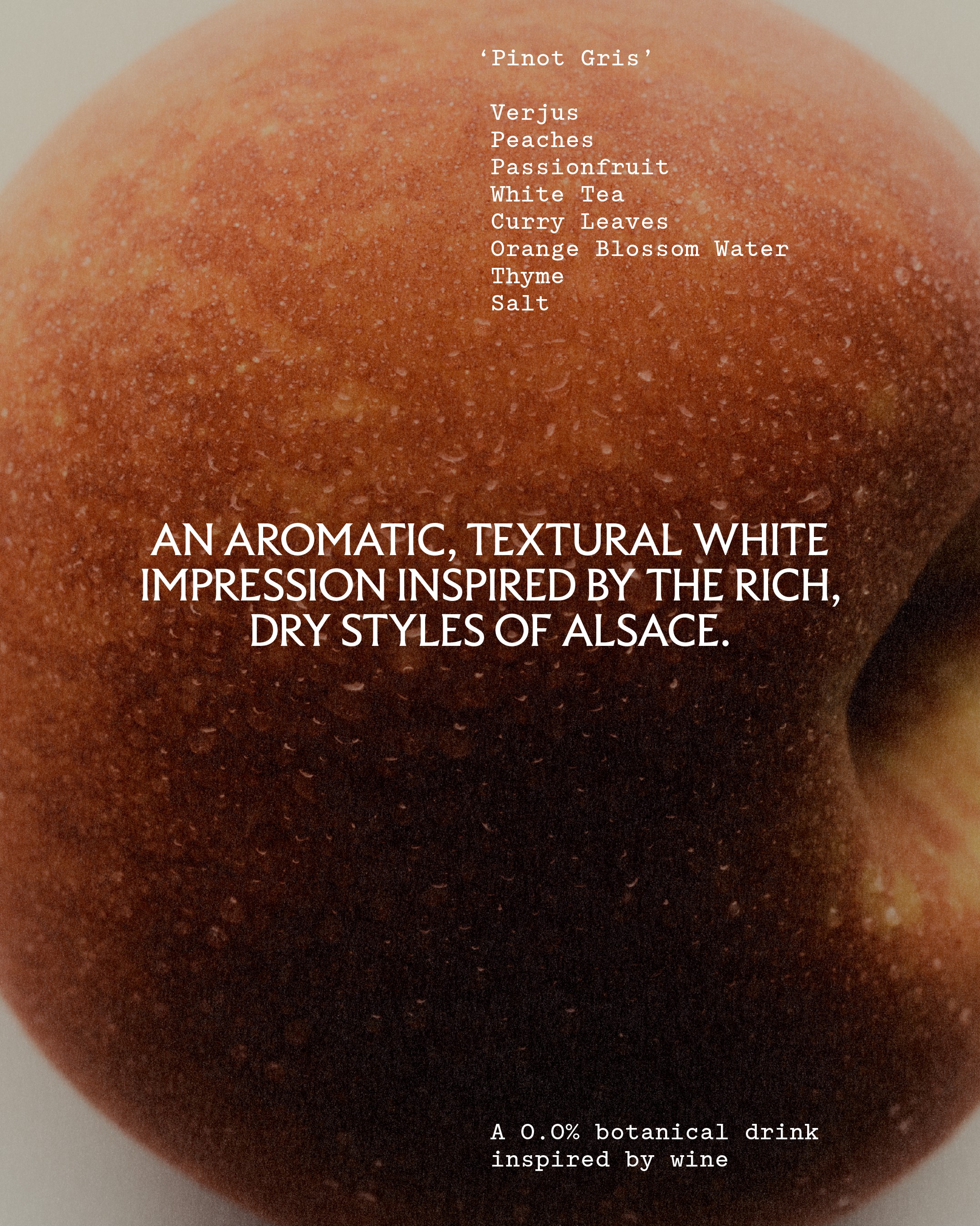
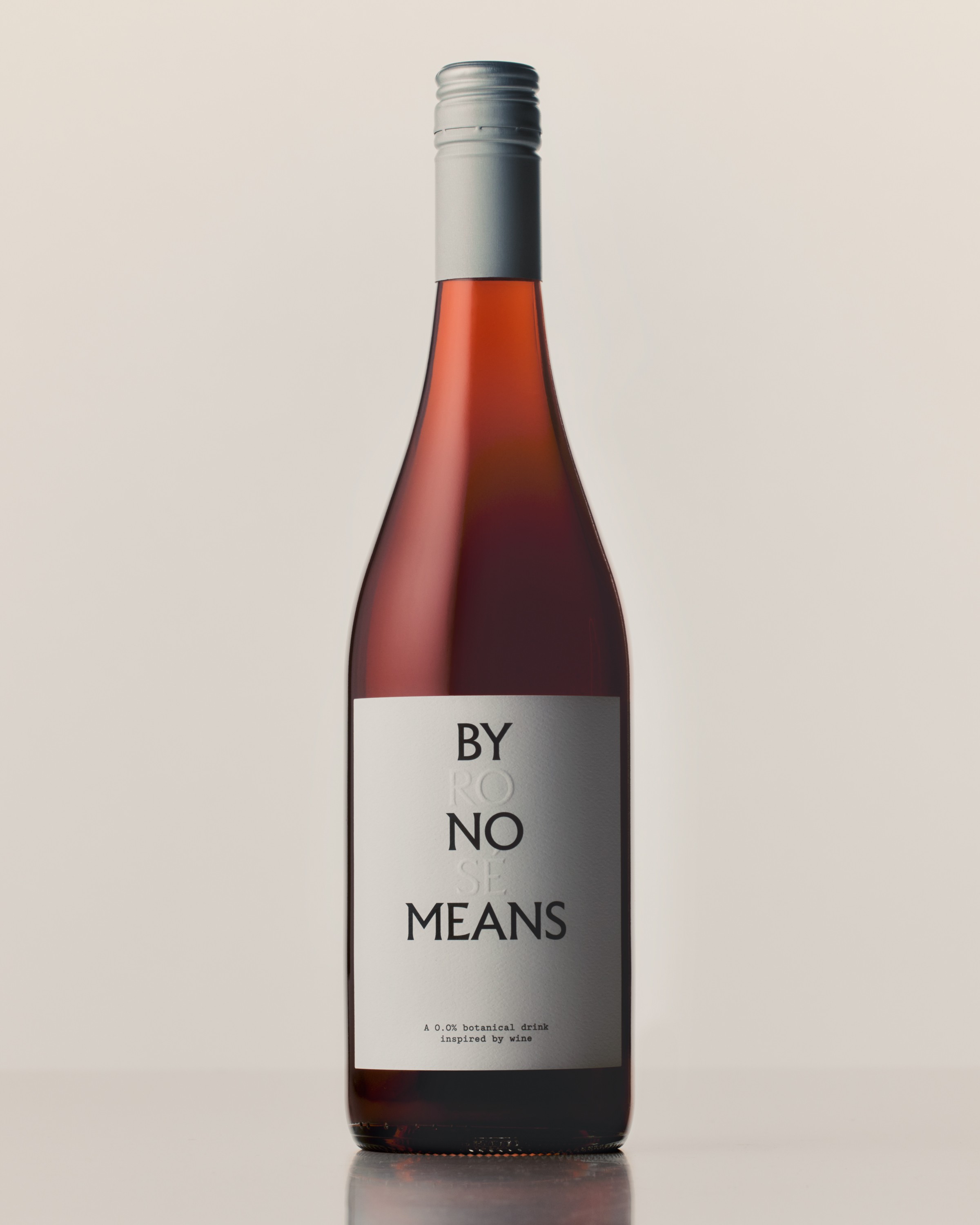
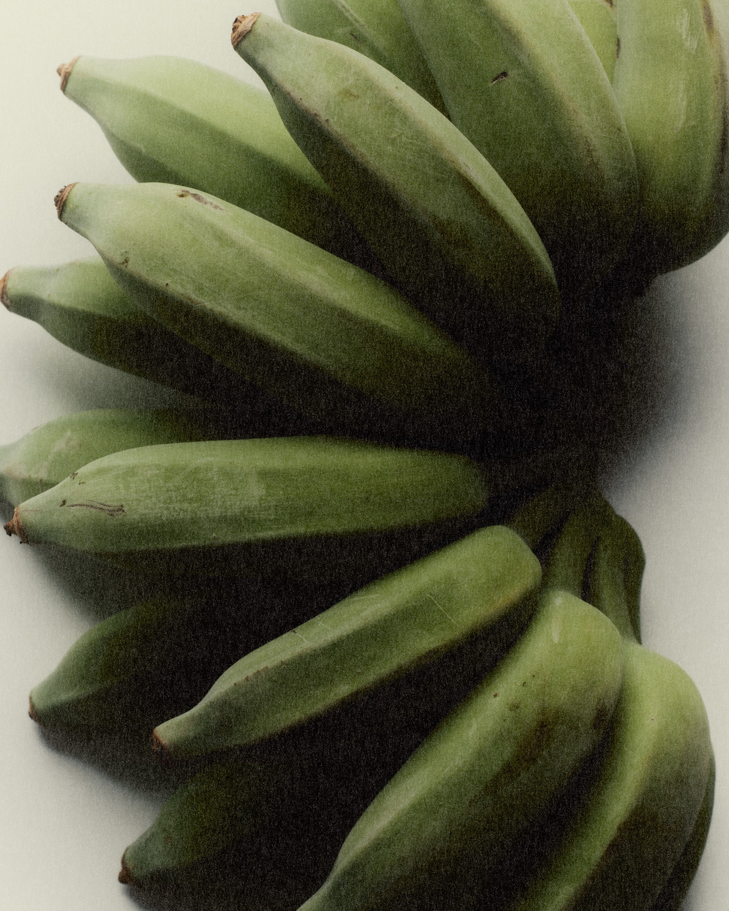
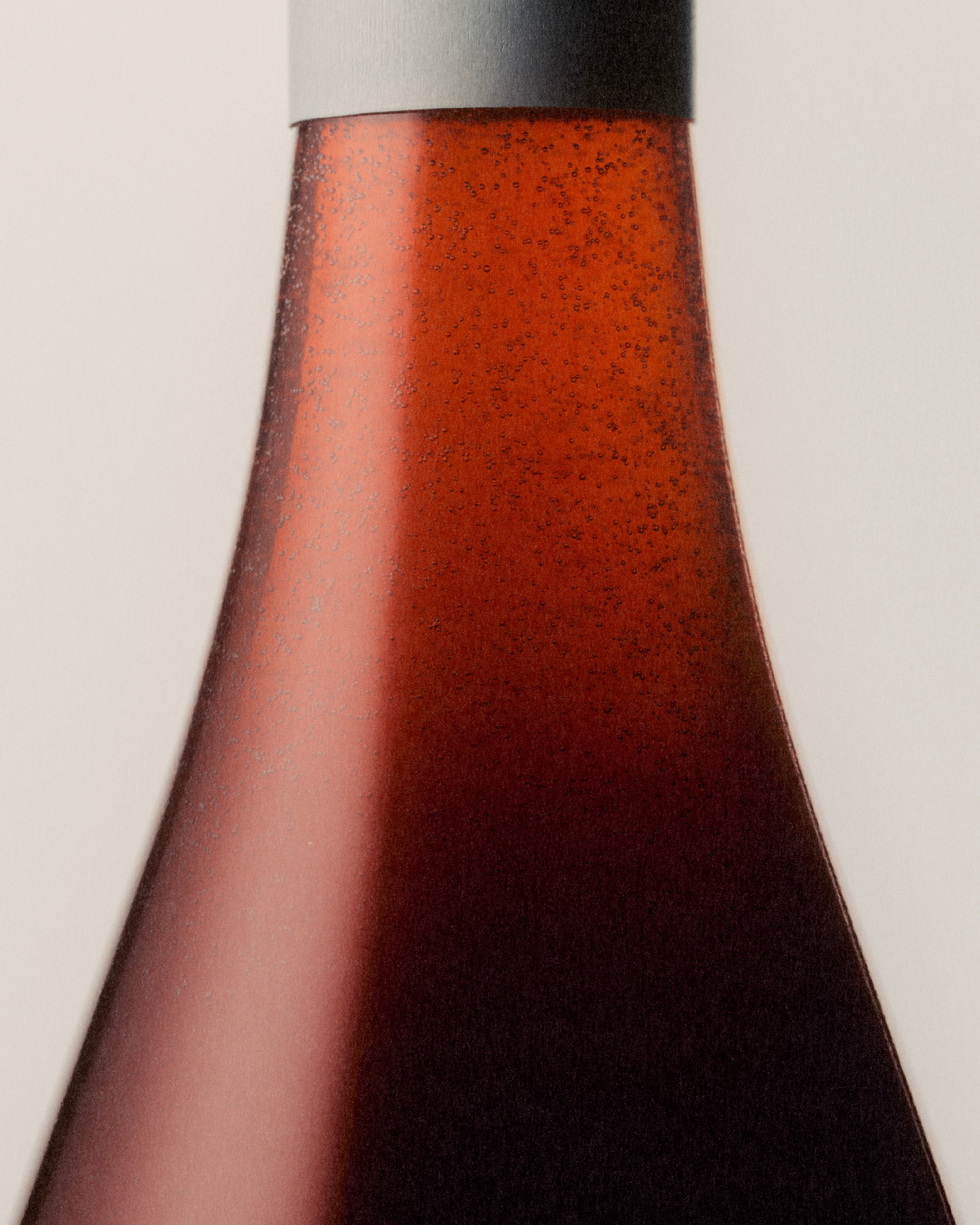
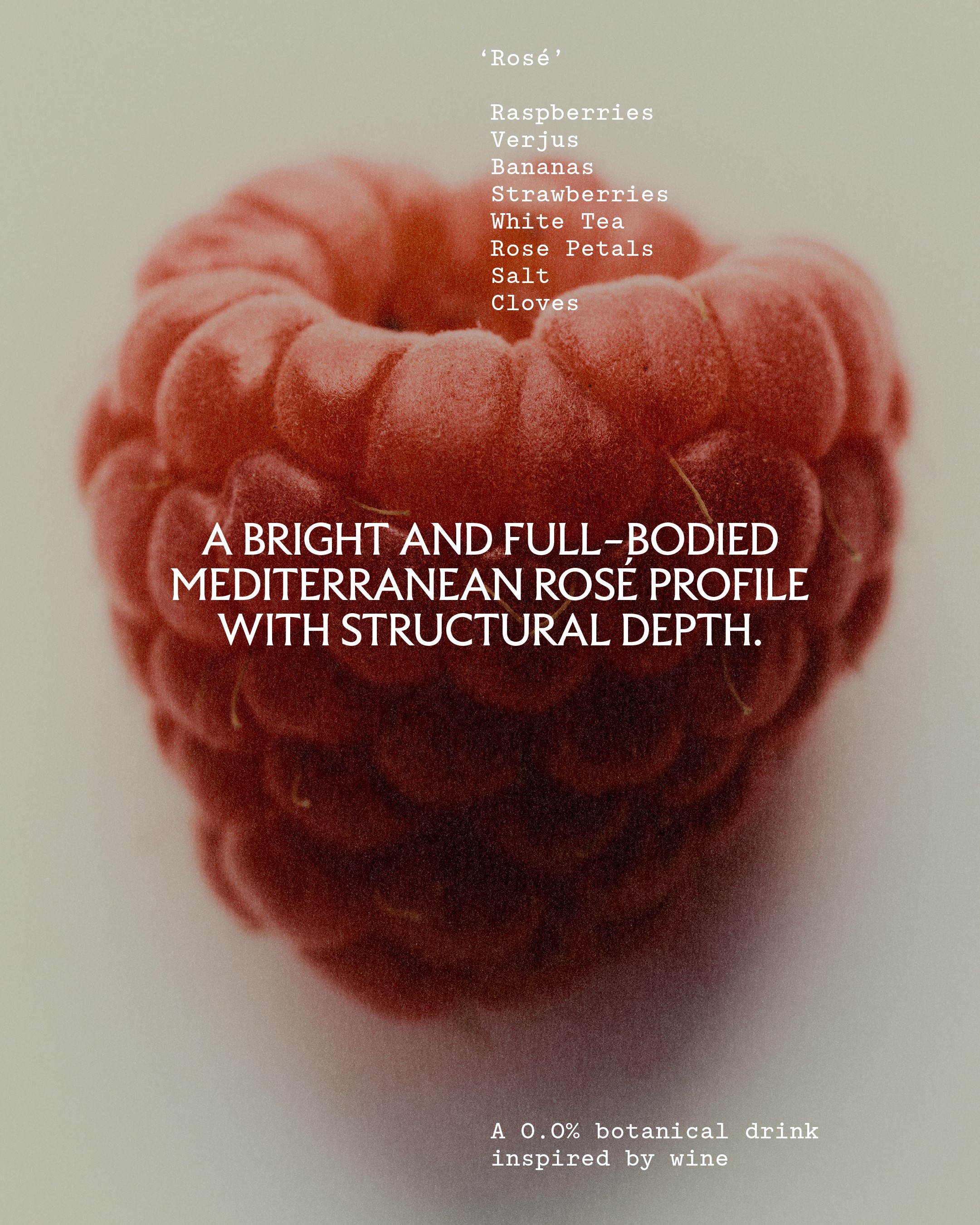
By No Means creates alcohol-free botanical drinks inspired by wine. Each varietal is built around the beauty of raw ingredients, meticulously balanced for texture, weight, tannin and acidity. The result is a botanical impression of wine, created specifically for fine dining.
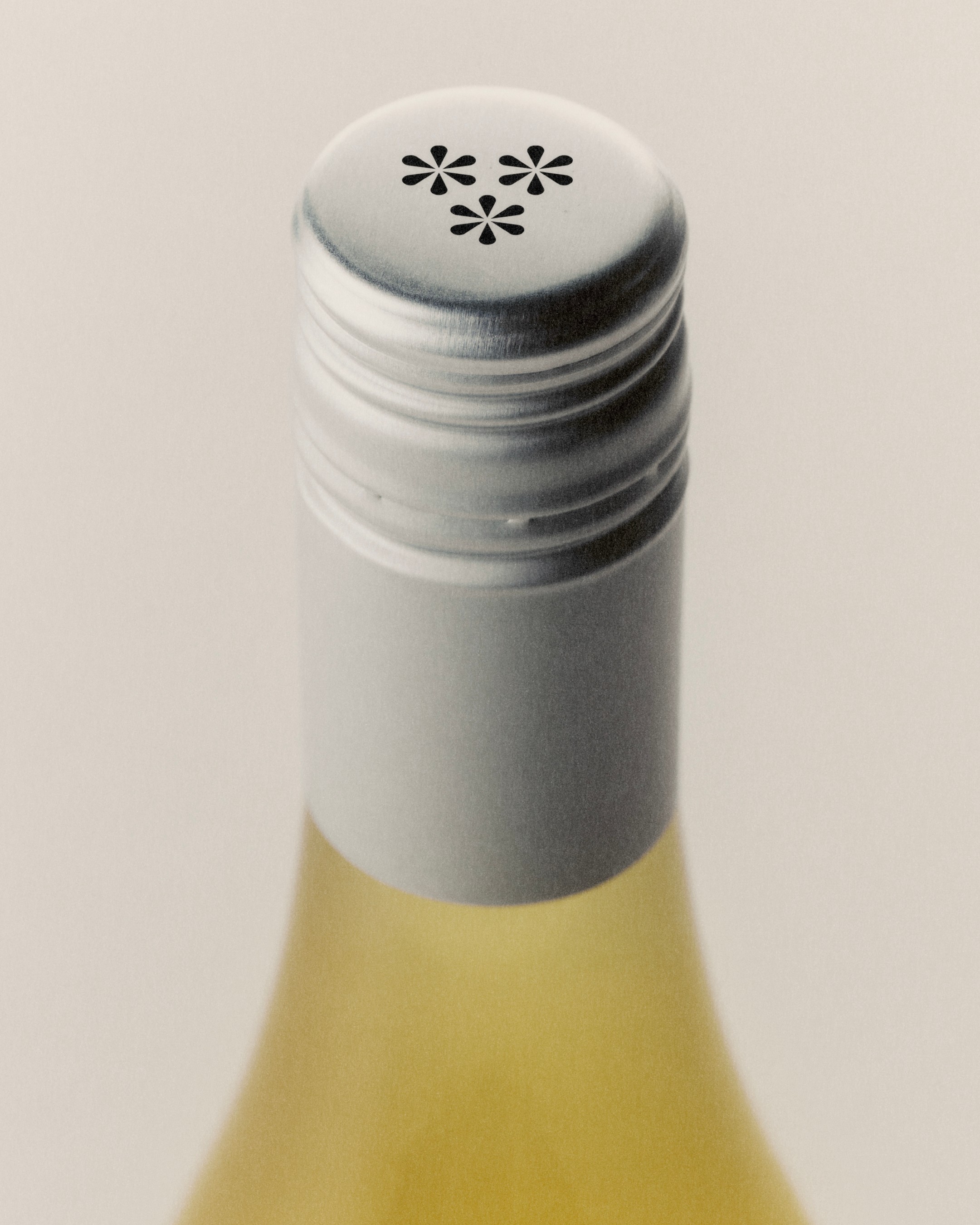
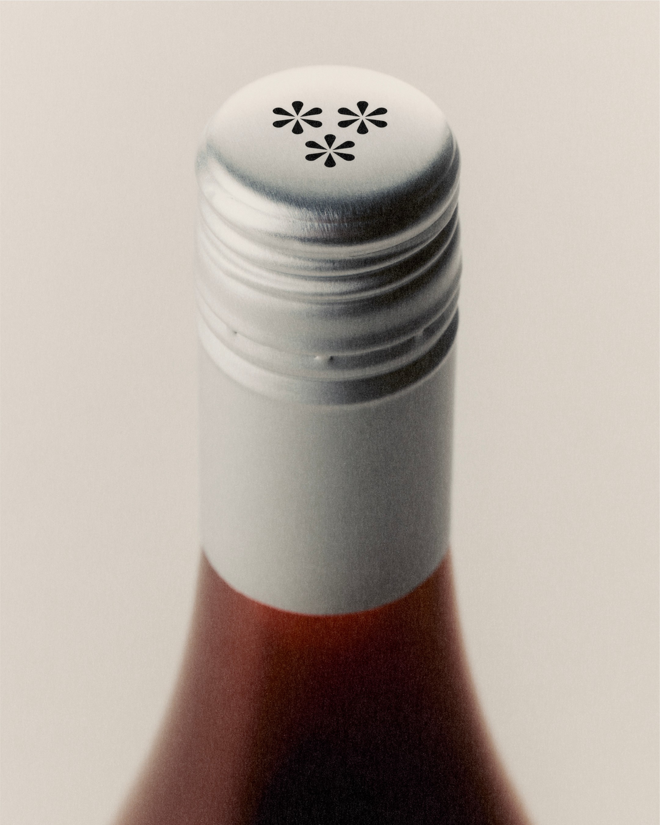
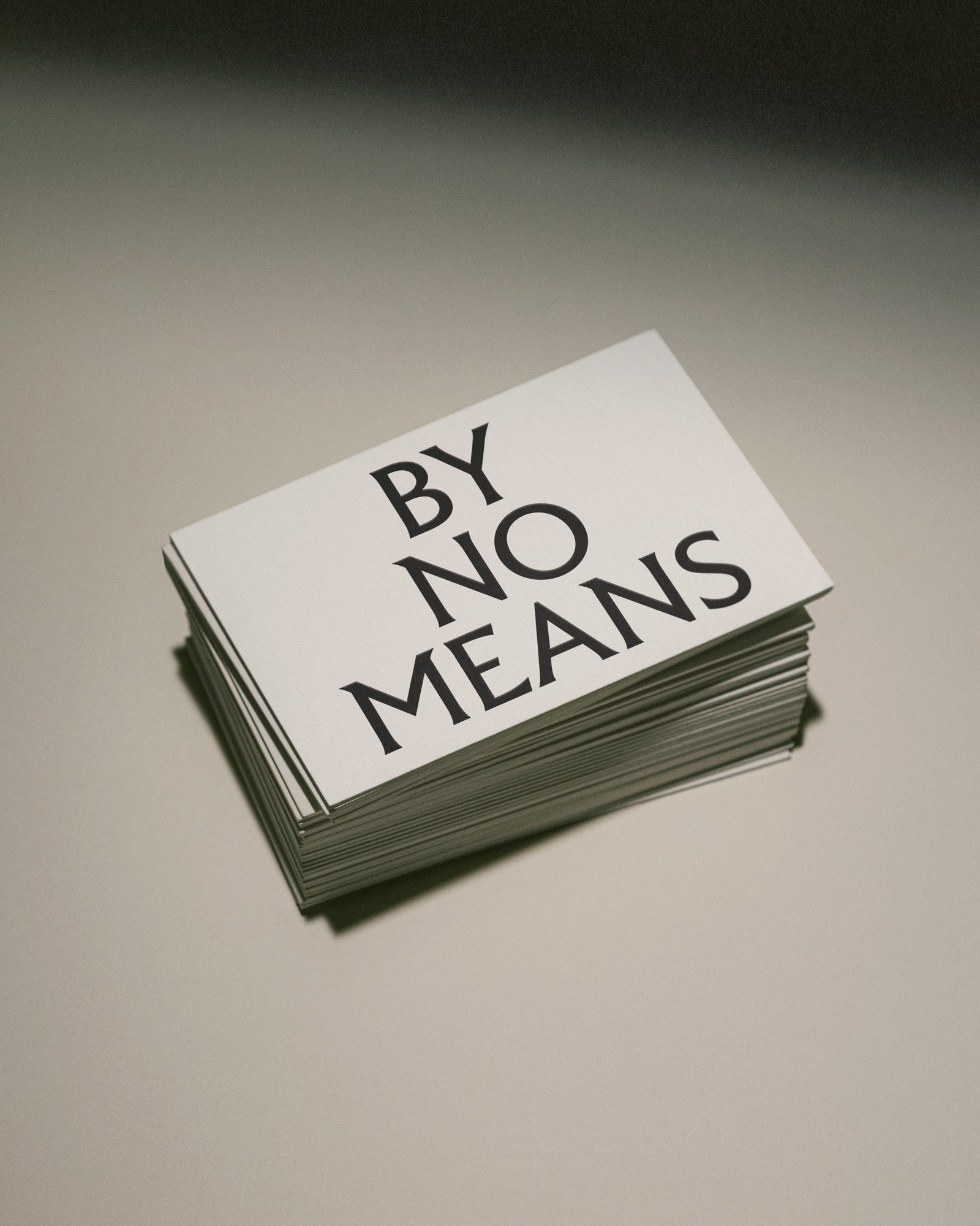
The typographic character of the new identity draws from the organic and the handmade, balancing irregularity with refinement. A new symbol, inspired by a typographic asterism, extends this language. Flipped to reflect the brand’s antipodean origins, the asterism evokes a bunch of grapes, subtly subverting the familiar form.
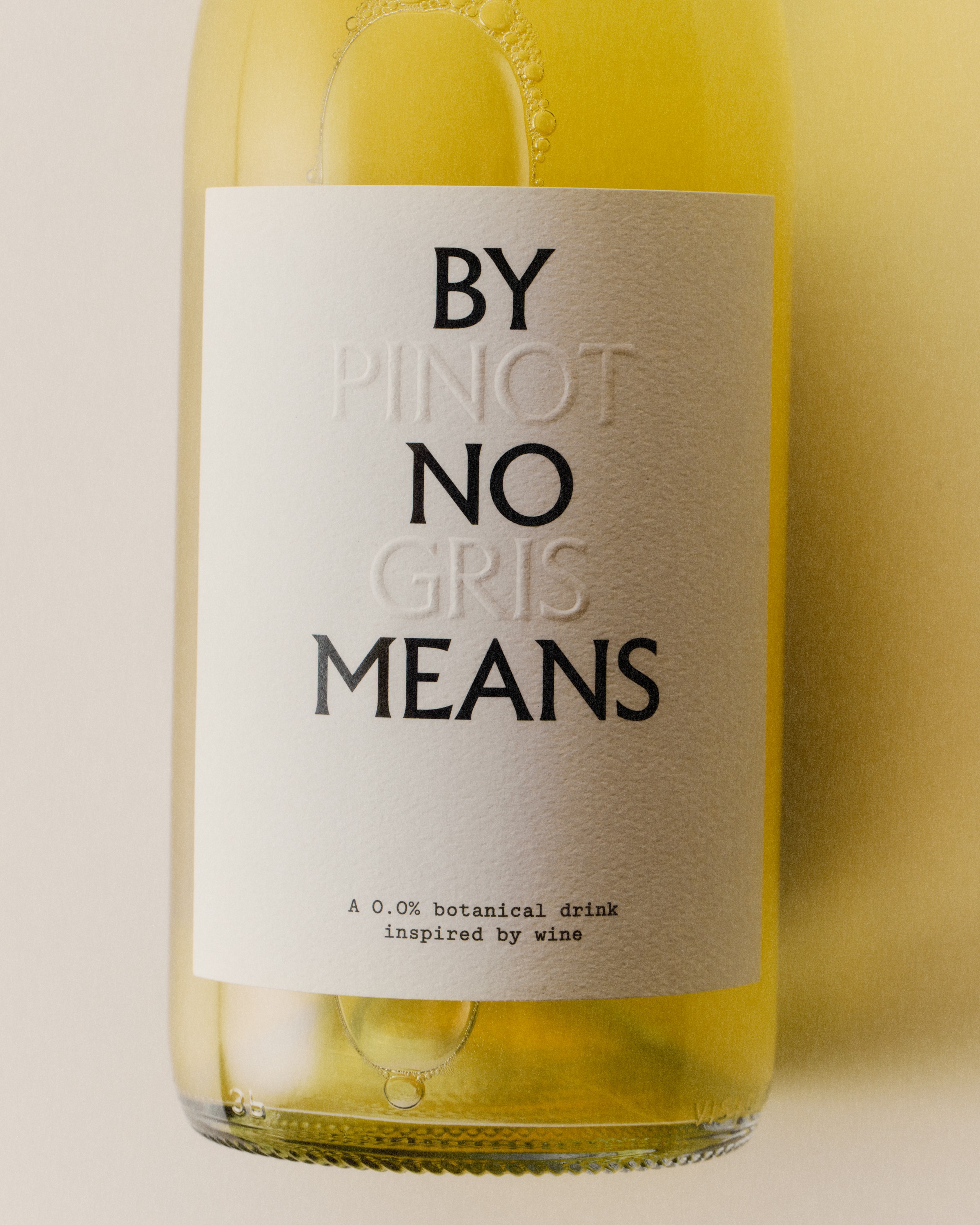
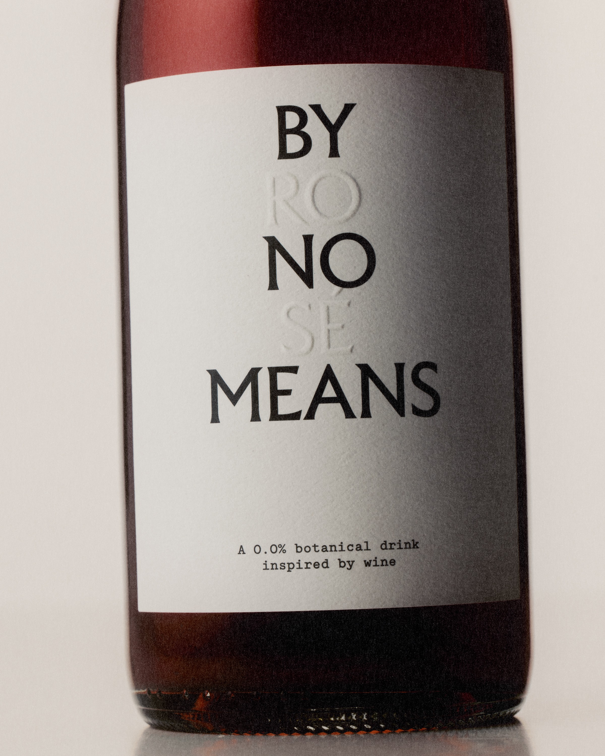
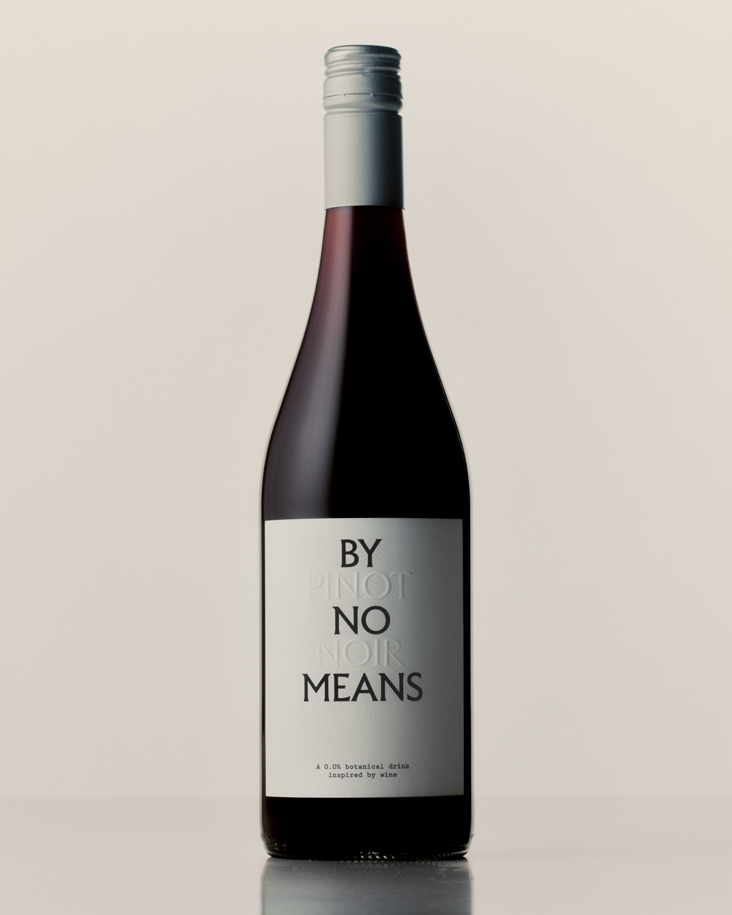
Packaging and label materials were chosen for their tactile qualities, textural character and environmental credentials. Reflecting the idea of an impression of wine, each varietal name is blind-embossed into the label, subtly integrated within the wordmark itself.